Do You Build Responsive Websites?

In a nutshell, a responsive website is a website that is compatible with all screen resolutions ranging from smartphones to widescreen monitors.
10 years ago we would have created two sets of designs, one for desktop and one for mobile. The biggest challenge we found with creating a mobile design is that it wouldn’t look exactly the same on all mobile devices. This created frustration for both our team and our clients. The solution was to shift our process to focus on creating a website to be responsive.
“Responsive Web design is the approach that suggests that design and development should respond to the user’s behavior and environment based on screen size, platform and orientation.” - Smashing Magazine, 2018
How does it work?
It may seem obvious based on its name, but a responsive design responds to the environment in which it is viewed. The way it does that is to rearrange certain content elements to display above or below other content (or sometimes content is actually hidden) based on the screen size.
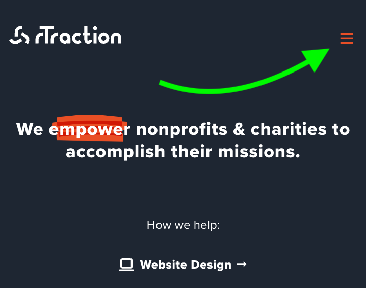
For example, when accessing a website on a desktop or laptop you may see a navigation menu made up of several links to different pages, however when viewed on a smartphone or tablet that navigation menu may be hidden behind a hamburger menu.
The change between a full menu and a hamburger menu will happen automatically depending on the screen size.
I want a mobile-first website, is that the same as responsive?
Not exactly, a mobile-first website is designed specifically for mobile screens and then adapted to larger screen sizes after.
Things to watch out for in responsive websites
Make sure that how the content is presented makes sense. Since responsive websites reposition pieces of content in order to fit the screen size, that may result in a change to the context of that content.
Spacing and alignment of content can also be impacted by a responsive website. Content that is left or right-aligned and close together on a larger screen may look fine but seem cramped and out of place on a mobile device.
Images also have to be taken into consideration. Wrapping text around an image could look okay on a large screen but on a mobile device that may impact the readability of the text and the impact of the image. Ideally, images should be displayed separately from text to be most effective and accessible.
We gave the example earlier of a navigation menu versus a hamburger menu, it is important to make sure your website's navigation adapts well to different screen sizes.
Why is a responsive website good?
A responsive website ensures your content is presented in a way that is most accessible to your audience. If someone visiting your website has a bad experience because they can’t navigate your website or find the content they are looking for then they are unlikely to come back.

