What Makes Good Social Media Design?

Creating effective social media design is crucial for nonprofits aiming to build support and engage followers. Well-crafted visuals can inspire action and connect deeply with your audience. Here’s a streamlined guide to achieving great social media design:
Consistency is Key
While adding as many colours and exciting fonts as possible to every design might be tempting, staying in line with your brand guidelines is always the best route. Not only does it create consistency on visual platforms like Instagram, but it also fosters brand recognition over time.
Photos of real people—clients, volunteers, or team members—add authenticity and help humanize your cause. A genuine photograph goes much further than a graphically designed post.
Companies big and small thrive on storytelling, so whether sharing behind-the-scenes moments, or providing project updates, make sure each post conveys a clear visual story. When real photographs taken by your organization aren’t available, consider high-quality stock images from sites like Pixabay or Unsplash, and always aim for visuals that will resonate with your audience.
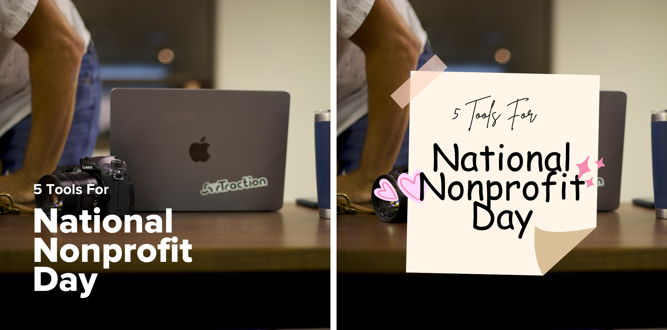
Clear and Simple | Distracting and Overdone
Create Accessible Designs
Most social media browsing happens on mobile devices, so keep your text legible and your layouts uncluttered. Think clean and simple. Plus, incorporate accessibility-friendly elements—like high contrast and alt text—to make your designs inclusive for everyone. And remember: white space is your friend. It enhances readability and helps your message shine.
Keep text minimal—we cannot stress this enough! Many organizations make the mistake of putting all relevant copy into a single graphic, making it hard for followers to read. Opt instead for using 3-7 words per graphic as a hook, putting the rest of the information in the caption of your post, and making it bold enough to be readable at a glance. Adhere to the 20% text rule (where text makes up no more than 20% of the graphic area) to avoid clutter in your images.
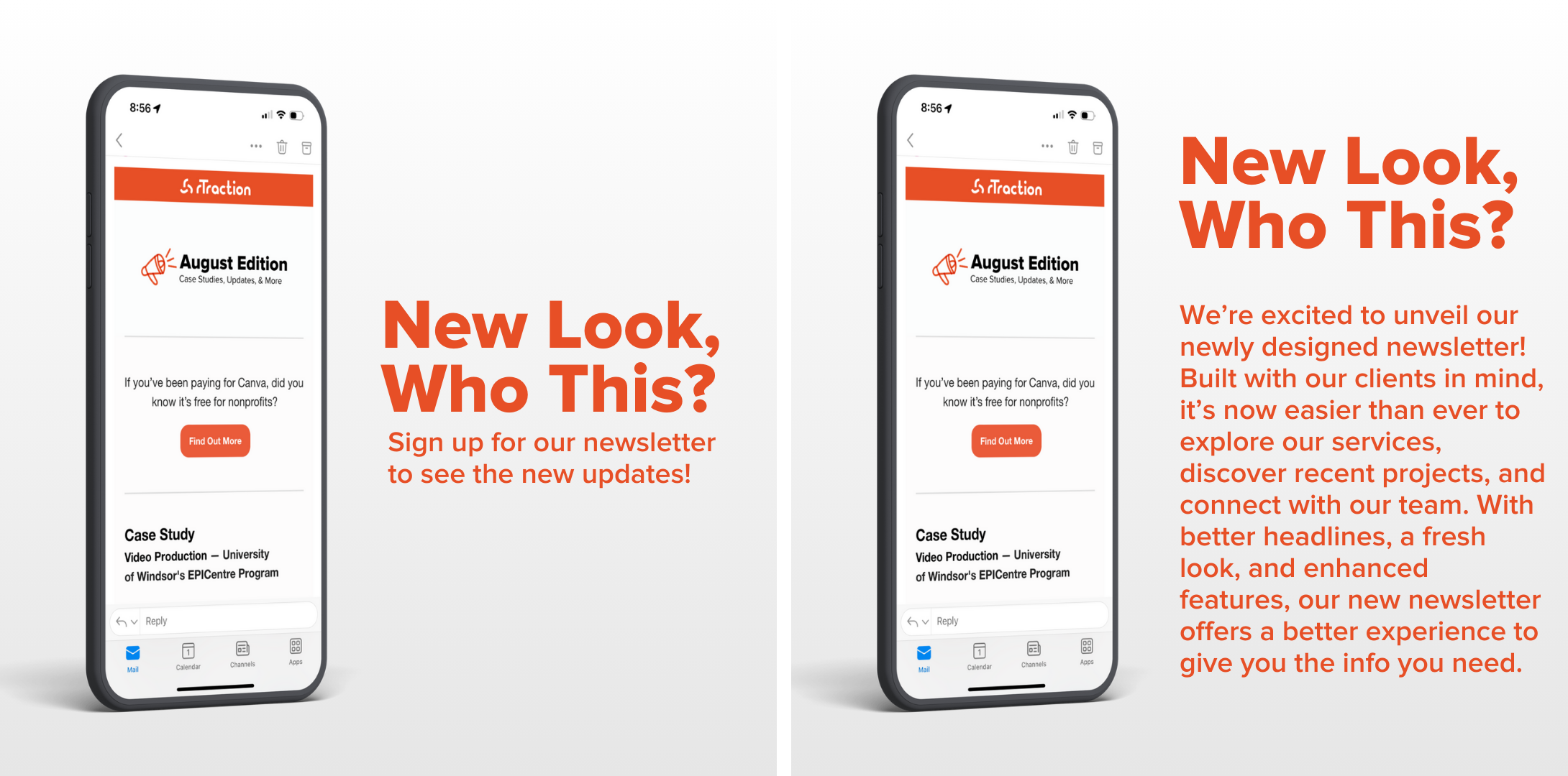
Clear and Simple | Distracting and Overdone
Alignment Matters
When it comes to design, alignment isn’t just about making things look pretty—it’s about guiding the viewer’s eye. Proper alignment creates a sense of order and balance, helping your audience navigate your message with ease. Whether centring a headline, aligning images to the left, or ensuring text flows neatly alongside visuals, thoughtful alignment helps your content look professional and polished. It’s like giving your posts a warm hug—everything fits together beautifully.
Tip: turn on margins in your Canva settings.
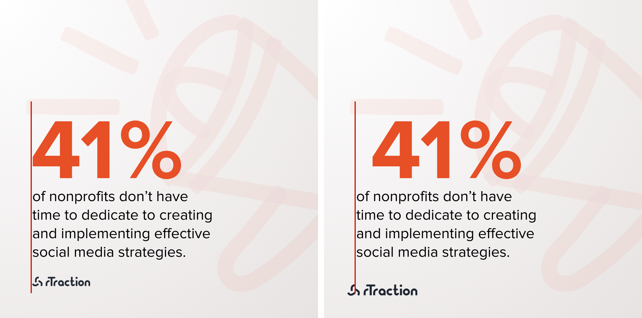
Clear and Simple | Cattywampus
Right Size for Right Medium
Different social media platforms have various recommended image sizes. Ensure your graphics are sized for each medium to maximize engagement and maintain visual integrity across platforms.
Track, Learn, and Refine
Good design is iterative. Analyze which posts perform well, experiment with different styles, and refine them based on your audience's preferences to continuously improve engagement. Remember, less is more—focusing on impactful, minimal designs can lead to stronger connections with your audience.
For nonprofits, social media design isn’t just about aesthetics; it’s about storytelling, engaging, and building connections. By focusing on consistency, impact, and inclusivity, your designs can amplify your mission and inspire action with every post. And remember, there are exceptions to every rule—you should always be trying different ways of sharing a message and getting creative!


