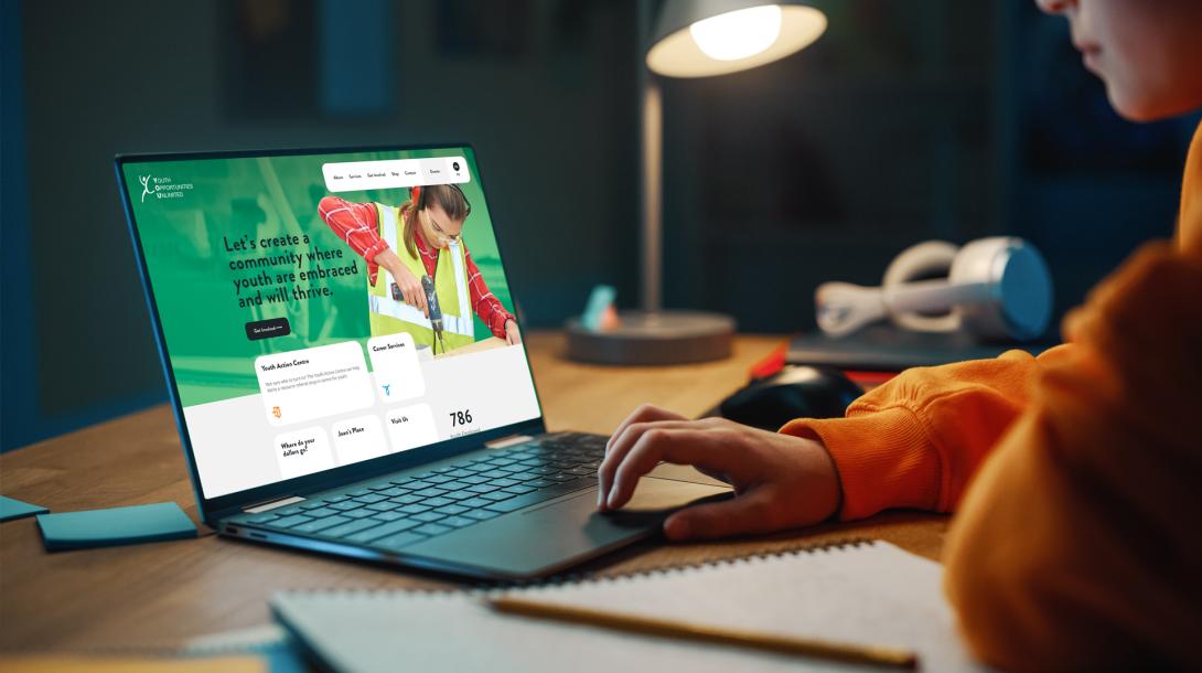
“rTraction and Youth Opportunities Unlimited (YOU) have developed a strong partnership over the years. When the time came for us to revamp our online presence, working with rTraction was the clear choice. The team at rTraction are so skilled at group facilitation, brand management, and web design, and we could not be more happy with the finished product! Our new website is centered around our brand, allows youth to easily navigate our programming, and lets the community know how they can become engaged.”
— JAMIE LEE ARSENEAU, COMMUNITY ENGAGEMENT COORDINATOR
The Story
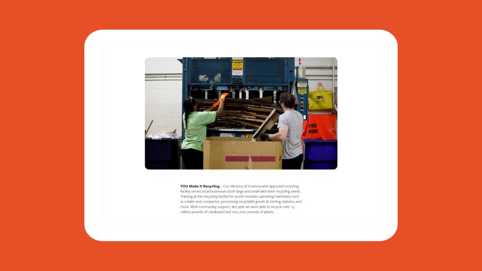
Youth Opportunities Unlimited (YOU) provides safe and active spaces for youth to build their confidence and independence. Serving over 3,600 young people throughout London and Strathroy, YOU offers a wide range of education, skills training, and employment initiatives to help build a community where youth are embraced and will thrive.
For 30 years YOU has attracted expertise propelling our community towards being a place where youth are embraced and can thrive. All this focused expertise is perfect for building community. Having such a wide offering, planning and executing a website and communication strategy that demonstrates the broad spectrum of the organization is key. That’s where rTraction can jump in to help. YOU is able to focus on their fantastic community building work and we support them in the background, setting up an easy to use website, smoothing out the gaps between services in their communication plan and keeping our eye on their online content over the long term to make sure it stays accessible, well designed, and clearly communicated.
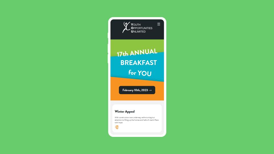
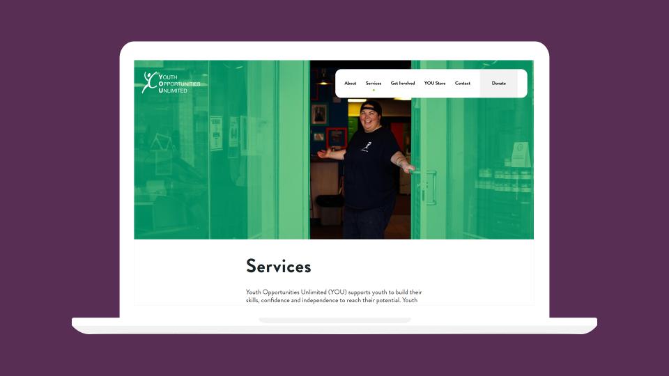
The YOU Website Redesign project called for customized workshops; a purposeful collaboration aimed at aligning the goals of the internal project team and the strategies rTraction set out to. They operate numerous initiatives that strive to help youth overcome barriers, and their new website needed to clearly showcase their stories, resources, and donation campaigns.
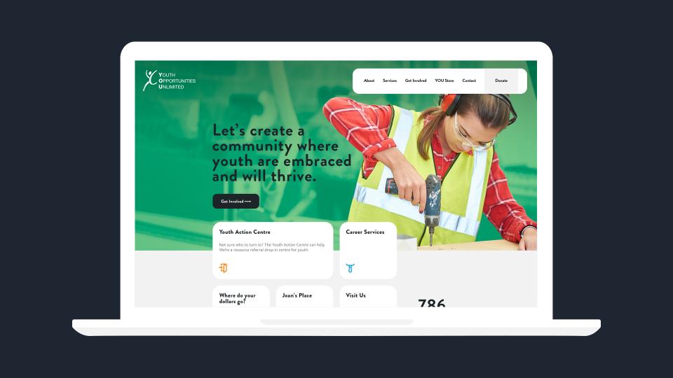
One of the main goals of the new website was to design a layout that was easy for youth to navigate because community members found resources difficult to find or staff needed to redirect clients. By increasing the highlight of important information and focusing on simplifying content, we were able to remove unnecessary touchpoints and remove confusing messaging. The goal was by creating a site that told a clear story, this would reduce the amount of time they spent telling their own story, and increase the time they have to continue writing it. This approach also gave way to improving the funnel of online donations and website contact requests.

